
ROLE
UX Strategy
Information Architecture
Navigation
Sketching + Wireframing
Interactive Prototyping
Usability Research
CLIENT
Baltimore Museum of Art
(with C&G Partners)
TOOLS
Figma
Google Suite
Context
In 2024, C&G Partners won a contract from the Baltimore Museum of Art to redesign their website and invited me to be on the project as the UX Designer. The BMA has a world-class collection of 97,000 works art, including the most works by Matisse of any public collection in the world. But the BMA had been receiving feedback from their members and patrons that their website was difficult to navigate, and their staff wasn't able to create the kind of robust content to make connections between the collection, exhibitions, and educational materials due to their legacy site's rigid templates.
Additionally, the BMA wanted their new site to embody their spirit of "bringing the world to Baltimore and Baltimore to the world" and center artists who were connected to the Baltimore community.
The Challenge
The Challenge
The BMA needed a new modern website that was easy to navigate (so that members and non-members alike could find the information they were looking for easily), modular (so that their staff could create flexible content and promote programming across the site), and reflected their connection to Baltimore.
Approach
Approach
Understanding client priorities, legacy BMA site, and landscape of comparable art museum websites
As I was onboarded, the C&G Partners project lead was completing stakeholder interviews with key members of each department; I synthesized client priorities from these interviews while cross-checking with the lead and project manager's acquired knowledge
Familiarized myself with the legacy site and the client's collected documentation of user feedback and pain points
Conducted landscape research and feature analysis of other museum websites

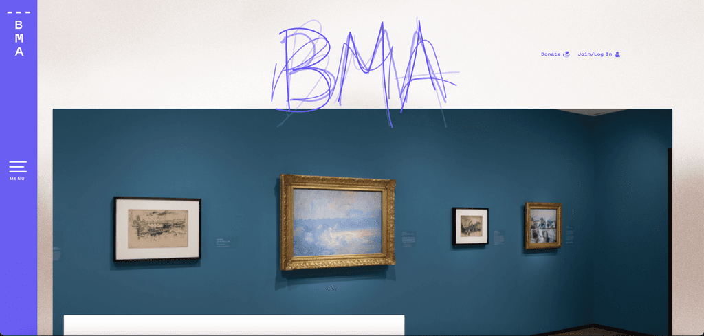
Current users expressed issues with finding critical information easily, especially about museum hours, ticketing, and exhibitions. On the homepage, the museum's hours are buried below the fold in text that is easy to bypass. Similarly, the BMA has free general admission, and yet this important information too is buried beneath the fold alongside the hours.
Another paint point for the legacy site was that the main navigation, search, and even the full name of the Baltimore Museum of Art was hidden behind a collapsed side drawer. Key revenue-building sections of the site like membership, were easy to miss under sections like Support.
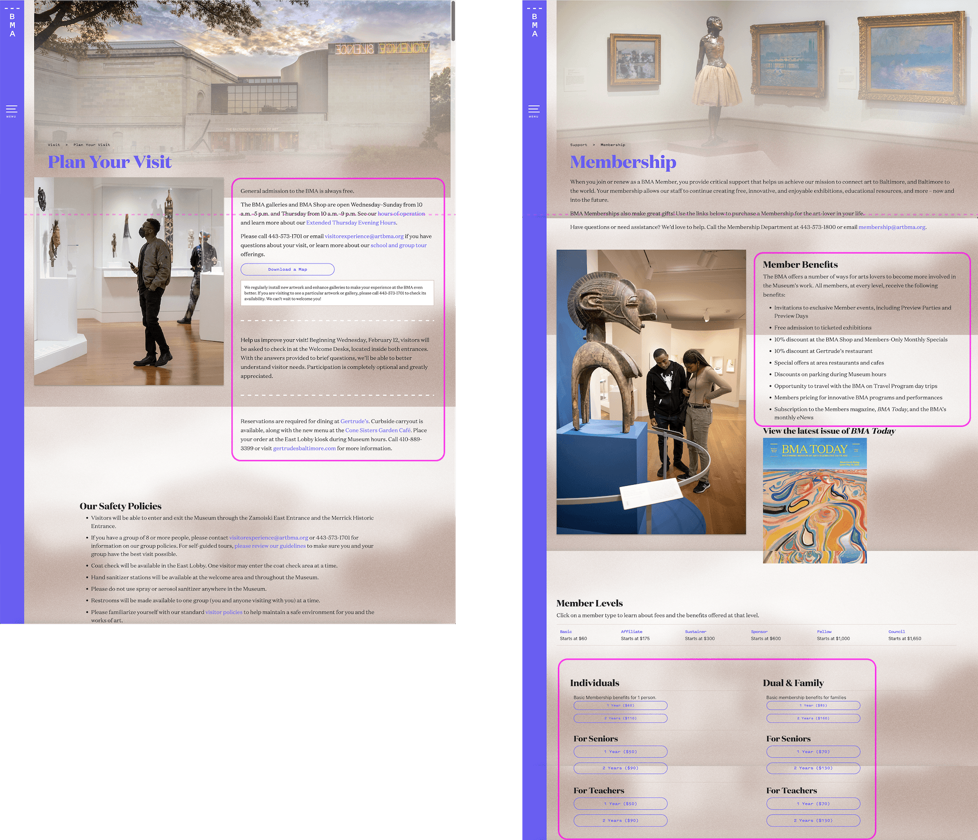
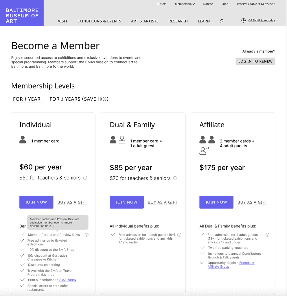
Across the site, the legacy site lacked visual hierarchy that would allow users to skim and find the information they were looking for. Some of the most mission-critical pages like Plan Your Visit and Membership had key information like hours, free admission, membership benefits and tiers all using paragraphs of body text. On the Membership page, a user would have to scroll several times to even start seeing the tiers and call-to-action buttons to join as a member. Existing members also had a difficult time knowing how to renew their membership.
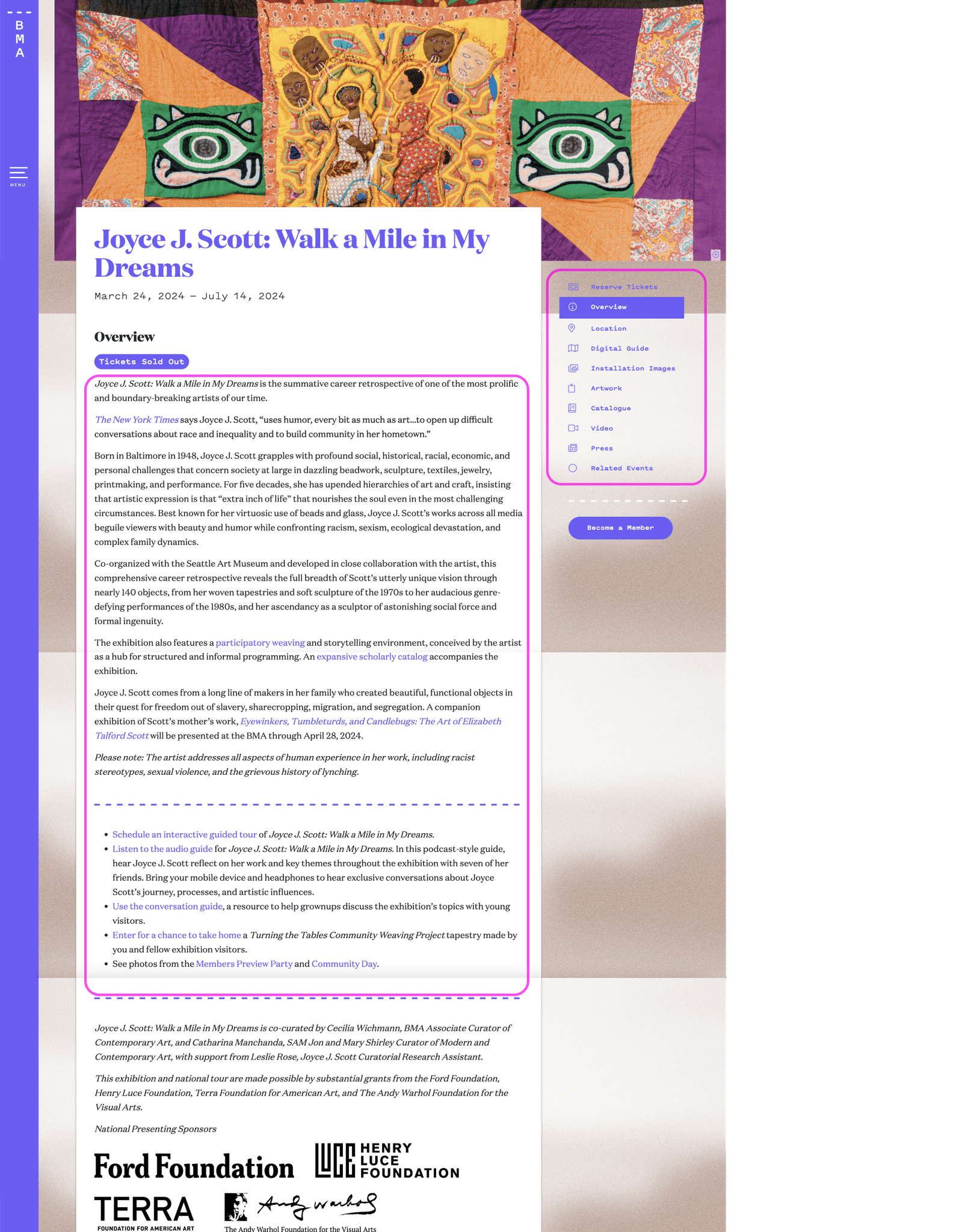
Because of the rigid templates of the legacy site, the content relied heavily on body text and hyperlinked text within the content to point users to other pages and opportunities to engage. For example, exhibition pages contained long paragraphs of text with hyperlinks to related events, audio guides, and special programming.
These were just a few of the heuristics that needed to be addressed.
Current users expressed issues with finding critical information easily, especially about museum hours, ticketing, and exhibitions. On the homepage, the museum's hours are buried below the fold in text that is easy to bypass. Similarly, the BMA has free general admission, and yet this important information too is buried beneath the fold alongside the hours.
Another paint point for the legacy site was that the main navigation, search, and even the full name of the Baltimore Museum of Art was hidden behind a collapsed side drawer. Key revenue-building sections of the site like membership, were easy to miss under sections like Support.
Across the site, the legacy site lacked visual hierarchy that would allow users to skim and find the information they were looking for. Some of the most mission-critical pages like Plan Your Visit and Membership had key information like hours, free admission, membership benefits and tiers all using paragraphs of body text. On the Membership page, a user would have to scroll several times to even start seeing the tiers and call-to-action buttons to join as a member. Existing members also had a difficult time knowing how to renew their membership.
Because of the rigid templates of the legacy site, the content relied heavily on body text and hyperlinked text within the content to point users to other pages and opportunities to engage. For example, exhibition pages contained long paragraphs of text with hyperlinks to related events, audio guides, and special programming.
These were just a few of the heuristics that needed to be addressed.
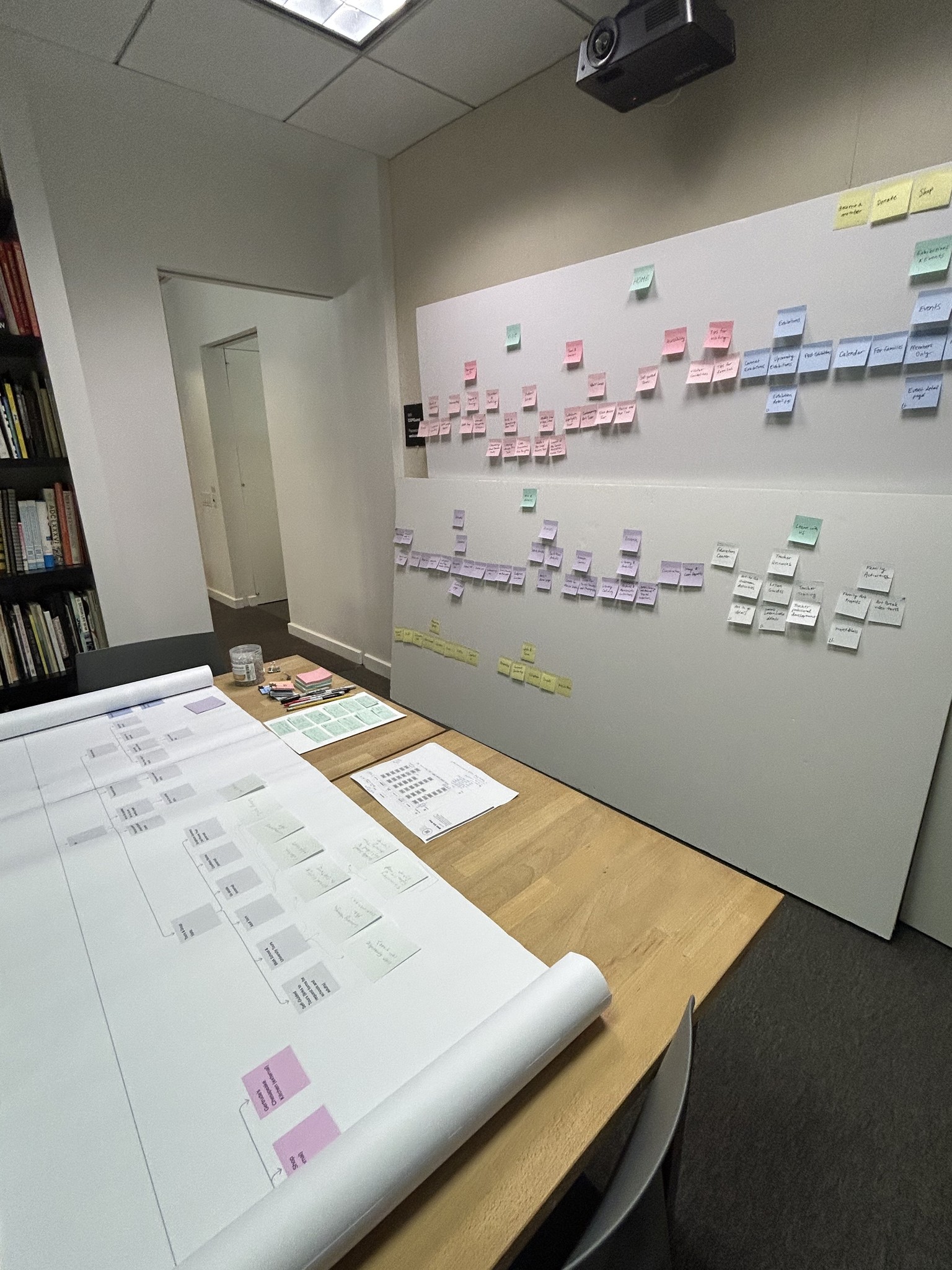
Site maps and information architecture
Created a sitemap of the legacy website
Reconfigured the sitemap into new information architecture to improve navigability and incorporate new types of planned content
Designed an interactive prototype of the new megamenu navigation and presented to the client for approval
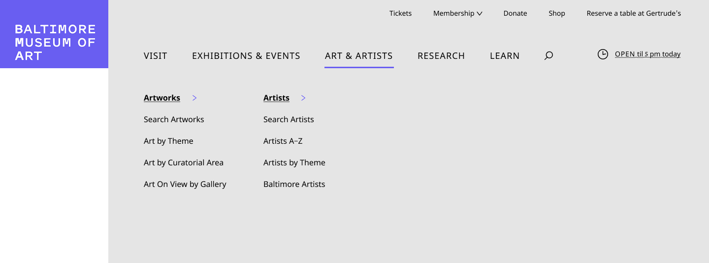
Because sitemaps, especially of large complex sites, can be overwhelming to understand at first glance, I mocked up an interactive menu wireframe, which showed the client how the sitemap would translate to the main navigation of the new site. We envisioned a megamenu to replace the main navigation hidden behind the hamburger drawer of the legacy site so that users could get an immediate sense of the website's organization and navigate quickly. We also included a utility menu at the top with quick links to priority actions for users. The current open hours are always visible on the top right for reference. To meet the client's needs of bringing a focus to Baltimore and its artists, we also featured a direct sub-link to Baltimore artists in the Art & Artists section.
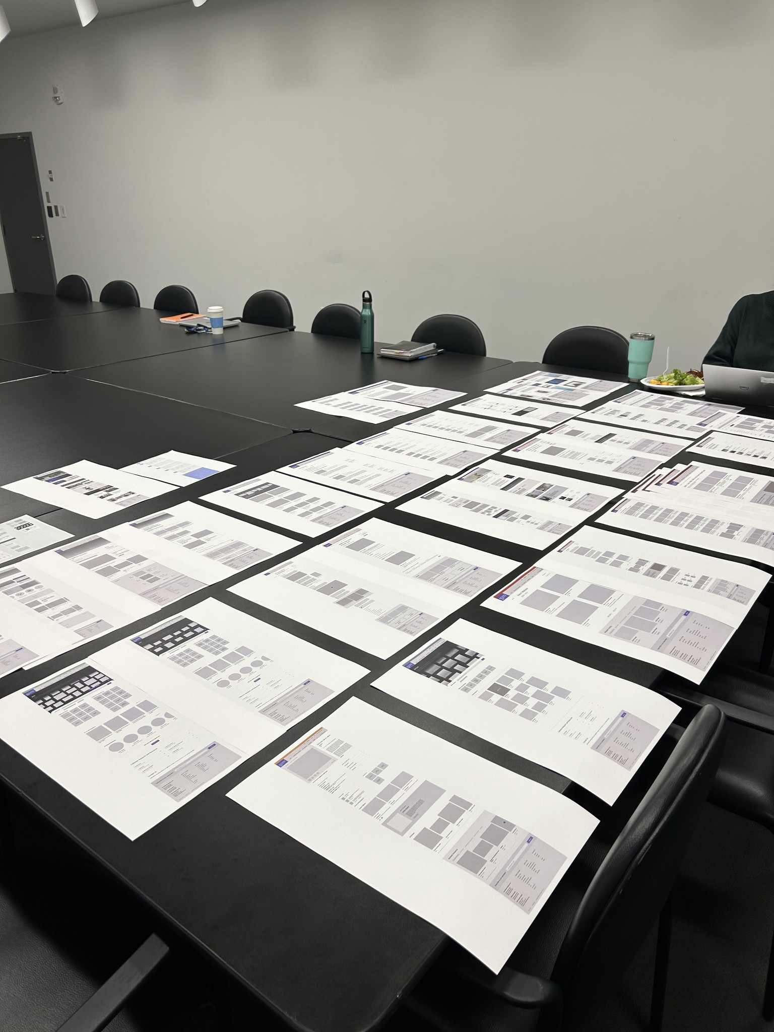
Identification and wireframing of templates and modular components
Identified 16 key templates and modular components based on client needs, exemplar sites, and technical alignment
Sketched template designs
Created wireframes and components in Figma
Identification and wireframing of templates and modular components
Identified 16 key templates and modular components based on client needs, exemplar sites, and technical alignment
Sketched template designs
Created wireframes and components in Figma
User testing
Created a user testing plan: identified 3 target user groups for testing and usability tasks for each, wrote email templates for recruiting and scheduling participants, and created a testing script for each user group
Collaborated with the client's project lead to recruit and schedule participants
Created high-fidelity prototype of wireframe pages for testing
Facilitated 12 participants in using the prototype to accomplish a series of tasks and recorded feedback
Insights, recommendations, and iteration
Synthesized findings from user testing into key insights and recommendations for iteration
Top key insight was that 100% of testing participants found the prototype of the new site easy to navigate with the new information architecture
Presented insights to client, and all design recommendations were approved
Updated wireframe designs, which included adjusting the visual hierarchy of the BMA's 3 distinct sites on the Plan Your Visit page, adding popups for additional information about ticketing and membership benefits, and other small adjustments
Wireframe template approval and handoff
Presented final iterations of wireframe templates and sitemap to client in Baltimore
Handed off Figma file and documentation of UX recommendations and insights to UI designer
Wireframe template approval and handoff
Presented final iterations of wireframe templates and sitemap to client in Baltimore
Handed off Figma file and documentation of UX recommendations and insights to UI designer
Solution
Solution
The BMA's redesigned site will have intuitive navigation and organization. Key information is no longer below the fold—hours, ticketing, membership are easily accessible in the main navigation and at other key points on pages.
The main navigation is further organized into subheadings and key links within each subsection for easy access to pages deeper within the sitemap. In order to find important information on the site, it now takes just one click instead of 3 or more.

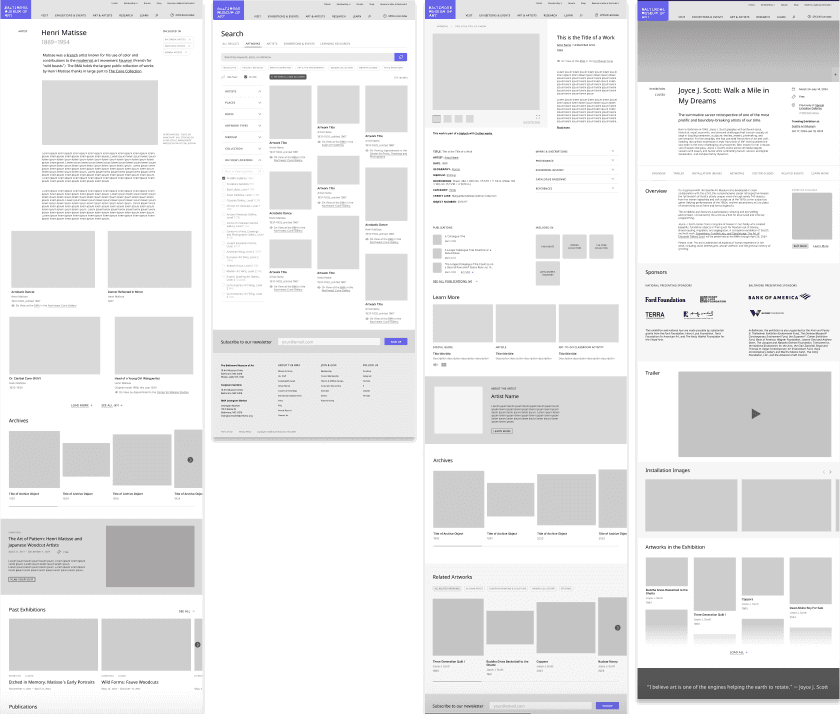
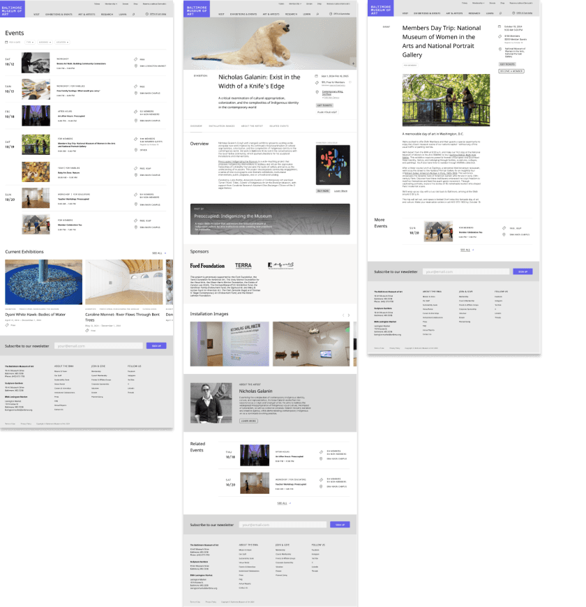
Page templates will be have modular content components with a focus on visual hierarchy and rhythm down the page so that more robust, visual, and organized content can be added to pages. These include modules for promoting one or several related events, artwork from the collection, featured artists, museum initiatives, and more.
In order to forefront the BMA's world-class collection that spans all continents and thousands of years, the Art page gives a visual snapshot of the breadth and depth of the collection. Users are encouraged to browse using the interactive, panning gallery view of works, which can be toggled into a timeline of key works in the collection. Further scrolling reveals other ways to browse the collection, including by searching the collection, browsing by theme, by curatorial area, or by what's on view in each gallery.
Although the spirit of the BMA and Baltimore will come through more in UI, I also incorporated the BMA's desire to forefront Baltimore artists by featuring artists in the main navigation and including a featured artist module to incorporate on several page templates.
Solution
The BMA's redesigned site will have intuitive navigation and organization. Key information is no longer below the fold—hours, ticketing, membership are easily accessible in the main navigation and at other key points on pages.
The main navigation is further organized into subheadings and key links within each subsection for easy access to pages deeper within the sitemap. In order to find important information on the site, it now takes just one click instead of 3 or more.
Page templates will be have modular content components with a focus on visual hierarchy and rhythm down the page so that more robust, visual, and organized content can be added to pages. These include modules for promoting one or several related events, artwork from the collection, featured artists, museum initiatives, and more.
In order to forefront the BMA's world-class collection that spans all continents and thousands of years, the Art page gives a visual snapshot of the breadth and depth of the collection. Users are encouraged to browse using the interactive, panning gallery view of works, which can be toggled into a timeline of key works in the collection. Further scrolling reveals other ways to browse the collection, including by searching the collection, browsing by theme, by curatorial area, or by what's on view in each gallery.
Although the spirit of the BMA and Baltimore will come through more in UI, I also incorporated the BMA's desire to forefront Baltimore artists by featuring artists in the main navigation and including a featured artist module to incorporate on several page templates.
Conclusion
This project taught me how to work on a design team with a project lead, a project manager, a UI designer, developers, and client contacts. It was important that we met project deadlines and communicated the complexity of the project in digestible ways when presenting to the client. This project also reconfirmed my strengths in information architecture and user research and testing.
Next: Smarthistory Website Redesign >
Next >
< Previous: Designing Social Change Reading Circle
< Previous
© 2025 Kayla’s Portfolio. All Rights Reserved.